Imagining the future
of the museum experience.

Overview
- Led a 6-week process to understand what guests needed during their visit and how digital could deliver.
- Guests wanted to see more diverse voices and current stories, explore on their own and have moments to recharge.
- New stories overlaid onto current exhibits could be an engine for new visits.
A guest’s relationship with the Museum of Science and Industry is multi-faceted, rich with interactions and transactions, and rooted in a shared curiosity about the future. As the Museum sought to engage new audiences and deepen connections to guests and constituents, we saw digital technology as a powerful tool that could amplify the guest’s core experience. We believed a thoughtful, well-designed system of integrated digital experiences could play a vital part in the Museum’s evolution as an institution.
By design, a Museum visit is a highly physical, interactive, and fundamentally social experience. It’s what makes MSI special. We didn't want to introduce useless layers and interfaces that can become a distraction or a barrier between guests and what they came to the Museum to experience in the first place. It’s also what makes layering new guest-facing technologies a difficult and careful process. Technology must not be introduced “because we can” but “because it’s what the guest needs/wants.”
Over the prior 2 years, the Museum had been busy replacing and integrating nearly all of its behind-the-scenes technology. Ticketing, finance, CRM, marketing automation, membership, parking, and whole-building WiFi and cellular. The foundation was set.
Two goals were defined:
Make the Museum more meaningful and accessible for all of our guests (and future guests).
Increase revenue through a variety of interactions and suggested activities.
A six-page RFP and rapid search process yielded Teague as the right external partner for the project. They were experts in “complicated spaces” like planes, airports, and large retailers. The Museum of Science and Industry was definitely a complicated space.
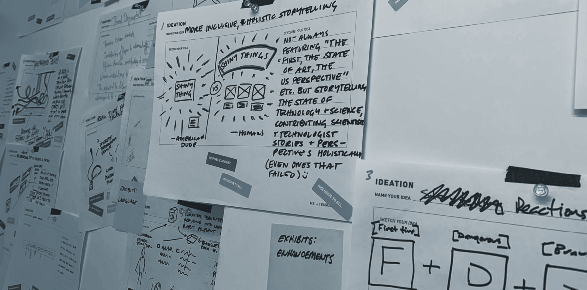
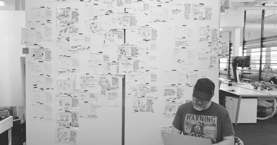
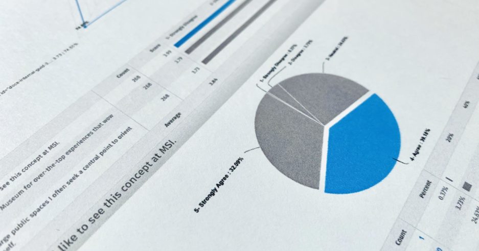
Together with Teague, we designed and executed a 6-week process to get at the core of what guests needed during their visit… not what the Museum hoped they might need. We brought together guest-facing staff from across the Museum for a 2-day workshop, engaged more than 300 guests on the floor and online, and slowly arrived at a central set of needs and (mostly digital) solutions.

The consultants might call this a “research-informed design-thinking program to address key challenges.” We just wanted to get at what our guests needed out of their time at MSI.
Contrary to early internal assumptions, guests didn’t want an app. They didn’t even want to use their phones during their visit. They wanted to explore on their own with a paper map made for them. Guests also told us (above all other concepts) that they wanted to see a greater diversity of faces, stories, and voices in the exhibits.

“Yes, yes, yes. THIS. Absolutely this. Please tell the stories of women, minorities, and others in STEM. I cannot stress how important it is for young people to see themselves represented as success stories in these fields.”
Museum of Science and Industry Guest
In addition to diverse voices, guests also wanted to see more “of the moment“ content in a science museum. And in a Museum of more than 600,000 square feet, they really wanted to sit down and recharge from time to time.
Together as a package, the Museum’s guests wanted a bit of guidance, a lot of connection, and some comfort. If the Museum could meet these needs, not only would current guests be happier and more engaged, but there’d be a whole new reason to visit again and again.
