Inspiring a visit at every scale.

Overview
- New site designed to inspire a visit and transact quickly
- Online ticket buyers were spending +$5 per guest
- Built and managed an international team to execute in 8 months
- Increased visit intent 16% and online ticket sales 200%+
In 2015 the Museum of Science and Industry needed a new website. Mobile's share of the website's 5 million+ users had increased from 7% to 30% (and later 60%). The 8-year-old site incorporated many forward-looking "mobile tolerant" features, but these were no longer enough.
The Museum's Marketing and PR team and also come to what’s now an obvious realization: The great brass doors on the front of the Museum weren't the true front doors of the institution, the website was. Every communication had the same call to action: "Go to msichicago.org." The website was important. It needed to inspire, inform, and convert. It seemed so obvious in hindsight.
The site relaunch was the first step in a larger digital guest engagement ecosystem. Knowing who guests were through online ticket and membership sales was the first step in establishing a robust CRM, guest segmentation, and marketing automation platform. It was also the best way to understand advertising spend efficacy. At less than 15% online sales, this was not happening.
To convince leadership to fund the relaunch, we ran a 4-week rapid research process. We conducted guest research, interviewed internal stakeholders, talked with experts, and reviewed website analytics. The key finding that convinced leadership: online ticket buyers were spending $5 more per guest than those that waited to buy their ticket at the building. Converting just 10% of counter ticket sales to online sales would pay the project in a year.
With a strategy in hand, we set out to find the right partners to bring it to life. Instead of attempting to find one agency good at everything, we split design and development into two different scopes to bring the best of each together into one superteam.
Leveraging our network, we lead a 5-week rapid global RFI and RFP round for design and a parallel smaller RFP for development. Dogstudio, a design firm from Belgium, was selected for their ability to convey a sense of place and emotion in their work. Busy Noggin, based in Dallas, was selected for their deep knowledge of TYPO3 content management system and leadership in the open-source community. An additional criteria: We would need to coordinate their work on a tight eight-month schedule. Would they be collaborative and empathetic partners? (They were.)
Over the next eight months, we led the 20+ person team across the three organizations, coordinating via Zoom and Slack (which we'd later disseminate across the Museum).
Building upon the Museum’s Strategic Plan there were three key goals:
Drive attendance-based revenue through compelling content, easy navigation, supporting guests and groups planning their visits and simpler transactions (paid tickets and experiences, membership sales, etc.)
Drive donations by simplifying the donation process and maintaining awareness of our education mission.
Know our customers better by efficiently collecting and consolidating customer interactions to help us drive future transactions.
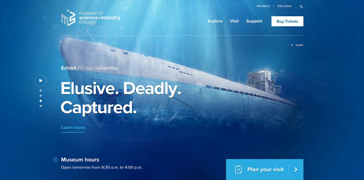
To this end, Dogstudio focused on conveying the same feeling of awe and amazement a guest has during a Museum visit. It wasn't about showing photos of grand spaces, it was about creating a feel for what it was like to be engaged in those grand spaces. This had to be matched with the right tools for the guest to understand, plan, and purchase their visit. Inspire then convert.

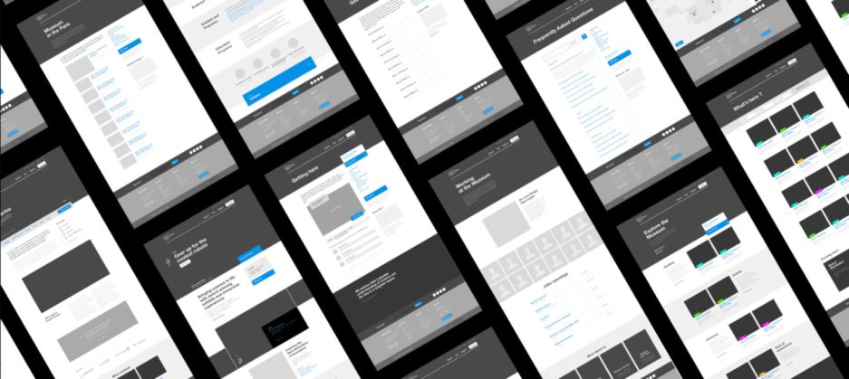
Busy Noggin worked closely with Dogstudio to turn static designs into a system of page templates and a collection of highly-configurable flexible content elements that were the foundation for every page. The Museum's internal teams used these content elements plus assets, references, and style sheets from Dogstudio to create the 800+ new pages required for the new website. Regular design/build check-ins allowed the team to adjust both design and code throughout the process.

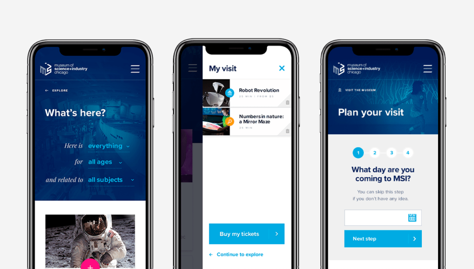
Ticketing was the final piece of the puzzle. The outdated ticketing experience was completely incompatible with the growing number of mobile users. To solve this, a new ticketing frontend was created for mobile and desktop. Prototype versions of the design were user-tested and refined. Busy Noggin developed the new ticketing experience, carefully integrating with the Museum's then custom middleware, Smart Visit.

The website launched in March 2016. Within a year, visit intent, a metric the Museum used to identify website guests looking to visit the physical Museum, had increased 16%. The new mobile-optimized ticketing experience doubled online ticket sales and set the stage for CRM, marketing automation, and data-driven decision making.
